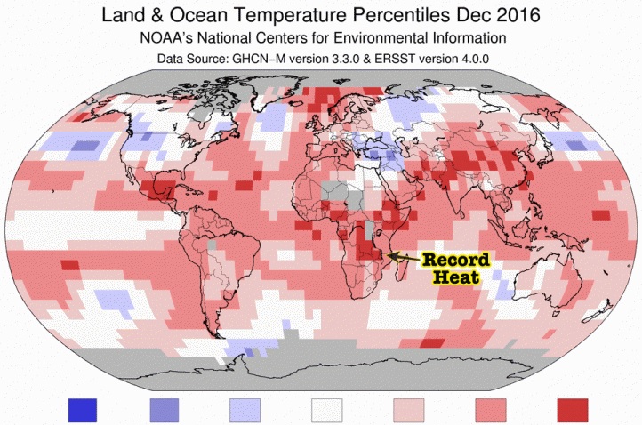
Climate maps released by the National Oceanic and Atmospheric Administration (NOAA) appear to have been manipulated to deceive the people and keep the "global warming" scam going.
Back in May, the NOAA released what it called "very informative" climate maps that display the average temperature across the world in April 2023 compared with the climate normal. However, the Swedish news outlet New Times pointed out that the two parallel maps from the agency contradict each other – even though they used absolutely the same measurement data. Both maps also depart from the official temperature records of many countries for that month, which showed a cooler spring than normal.
The first map released by NOAA displays land and sea temperature changes from the average in April, where the average is calculated based on the 30-year climate norm, in this case the period between 1991 and 2020. It is color-graded on a scale with 0.5-degree accuracy – displaying colder deviations in blue shades, neutral in white and warmer deviations in red. This map is what climate researchers often use.
The second map, which NOAA posted on the website of the National Centers for Environmental Information, is used by the mainstream media when doing climate reports. This "media-adapted map" does not mention temperatures, percentages or any true value. Instead, undefined temperatures are contrasted with an average, which is also not clearly specified, unlike the "researcher version" of the map. (Related: 96% of NOAA heat measurement stations are corruptly placed to support climate change hoax.)
Seeing red: NOAA's map for the media is "warm" all over
It is worth noting that unlike the first map provided to researchers by NOAA, the second map is almost completely red. The weaker blue shades are very grayish, producing the illusion that everything appears warmer and nothing cooler. It has made a deceitful impression that April is warmer than normal, even in parts of the world where official data is showing the opposite.
Cold and snow records have been set globally for both the winter and spring seasons. All continents have experienced cold and precipitation that substantially differs from the so-called climate normal, which is the average of the identical measurement data over three decades.
A recent examination in detail of temperature, snow and ice data for the months of April and May from around the globe has found numerous interesting variations. Moreover, the winter season's snow mass and bound water quantity in the northern hemisphere are considerably higher than normal.
As reported by the Canadian climate authority Environment and Climate Change Canada (ECCC), their own statistics revealed that the amounts of water locked up in the northern hemisphere's snow mass at the end of April this year add up to about 2,600 cubic kilometers. The norm is only about 1,600 cubic kilometers.
This indicates that this winter was over 60 percent more snow-rich than the norm for the period between 1998 and 2011. In at least 13 states, many of which are situated in the southern U.S., the snow covered twice to 4.5 times as wide areas as normal.
"What makes this temperature fraud so serious is that it is used to prove an alleged man-made global warming, a narrative that globalists then use to impose on the world’s governments and populations a total restructuring of society and our lives," wrote the New Times' Christer Ericsson.
"These mandates have already seriously damaged energy and food security, eroding Western treasuries and private economies, and taking away a large part of our freedom and quality of life."
Watch this video below explaining how the NOAA is pushing junk science.
This video is from the Real Free News channel on Brighteon.com.
More related stories:
NO WARMING AT ALL: Global COOLING continues for eighth straight year, according to NOAA data.
Is the climate being engineered?
Weather forecasters: El Niño is coming this summer and will likely stretch into winter.
Sources include:
Please contact us for more information.


